I rebuilt a psychiatry site around one rule: nothing jumps at you.
Brittany runs a solo psychiatric practice in Arizona. I designed and deployed a full four-page site for it as a demonstration of what the practice could look like online: warm dark palette, plain-language fees, a crisis line that is always one glance away.
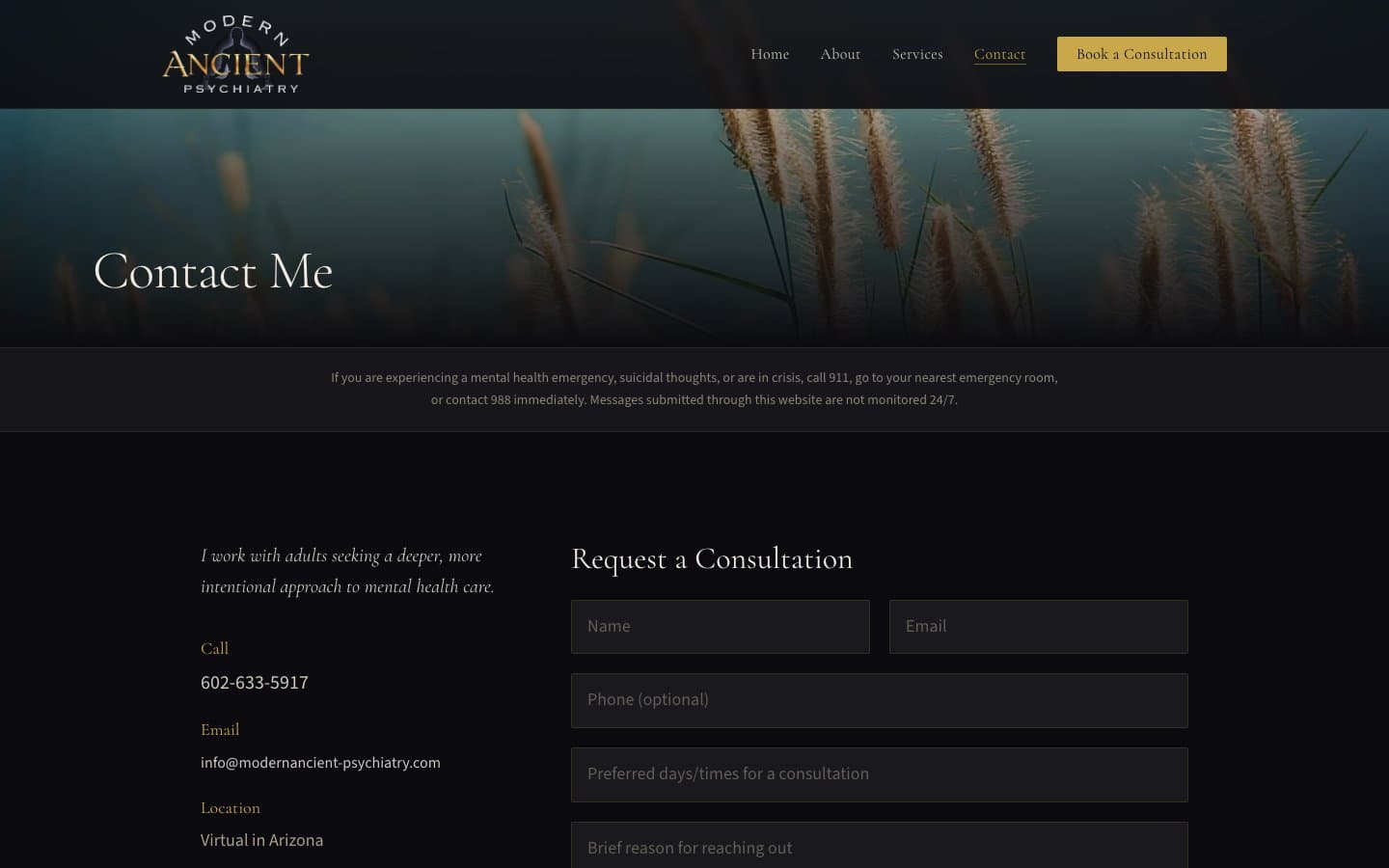
It is a concept build, and it behaves like one. Search indexing is switched off so it never competes with her live site, and the contact form does not deliver mail. Submit it and it tells you so, then gives you the practice's phone number and email. A form that silently swallows a message from someone in distress is worse than a form that admits it is a demo.

A template can't earn a patient's trust
The practice's site looked like every other healthcare template: centered headings floating over stock-feeling nature photography, a highlighter-yellow button, and one padding value on every section so the whole page read as a scroll rather than as a document.
For a self-pay integrative practice, the site is the first impression, and the people forming it are frequently anxious. The brief was not to make it prettier. It was to make it quiet, specific, and obviously prepared in advance.
Four pages, one grammar
Home
A split hero: the headline sits in the black field on the left, the photograph is a contained plate on the right, and a gold hairline circle straddles the seam between them. Below it the crisis line and 988 sit in their own band, then three statements in the practitioner's voice, then a ruled index of what makes the practice different, then seven questions.
About
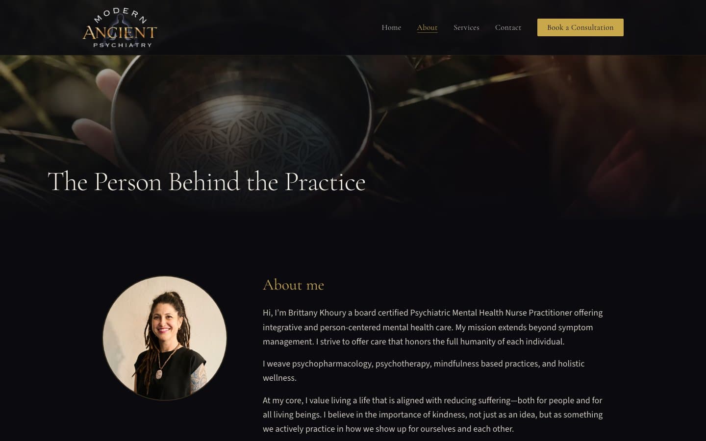
Her clinical background and her life outside the work, in first person. The page turns on the Metta mantra, set as four verse lines inside a gold ring with the final clause rubricated in gold. That is a real manuscript convention, and it does more for the practice's character than a pull quote would.
Services
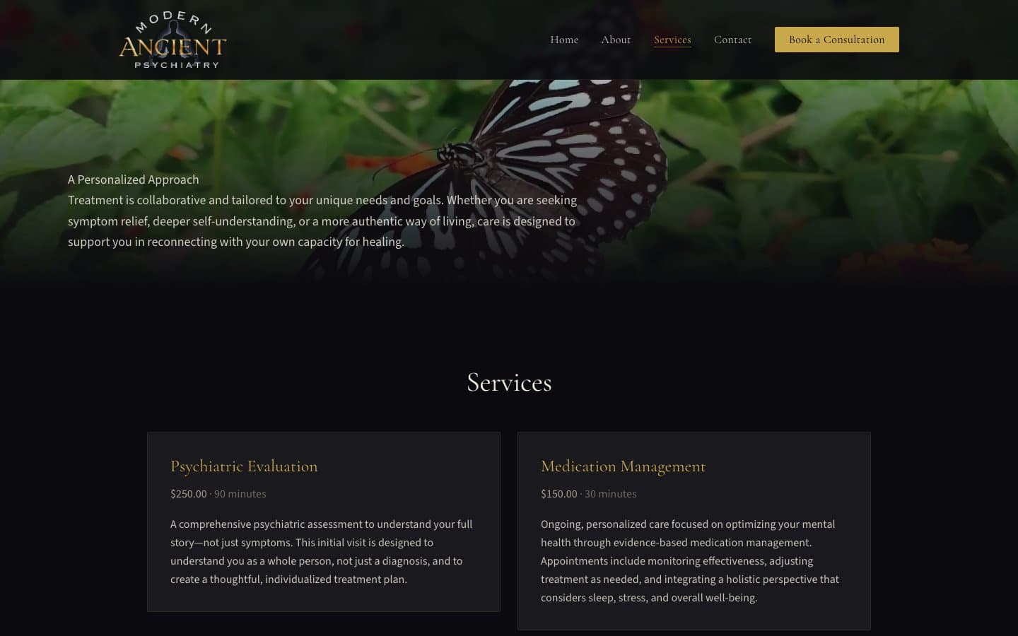
Four appointment types with fees and durations on one tabular column, three treatment approaches, and eleven blocks of policy: insurance, cancellation, the No Surprises Act Good Faith Estimate, controlled substances. All of it ranked as an index with hanging numerals rather than boxed into a pricing grid.
Contact
Practice details as a ruled index on the left, the form on the right. Underline inputs with a real label above every field, no boxes. The form does not deliver mail and says so plainly when you submit, pointing at the phone number and the email address instead.
Every choice answers to the reader
The reader is the constraint, not the brief
Someone arriving at a psychiatry site is often dysregulated and embarrassed about needing help. I wrote three promises into the design document and made every later decision answer to them: nothing will jump at you, someone prepared for you in advance, you can go at your own pace. When a change made the page more persuasive but less quiet, the change lost.
An index, not a card grid
The services page used to be two columns of bordered boxes. A grid asks you to comparison-shop seven modes of psychiatric care. A ruled index with hanging numerals and fees aligned on one tabular column lets you read down, find the fact you came for, and stop. Only one of those is trauma-informed, and the same object now carries services, fees, policies, and the FAQ.
One hue, split by job
The inherited gold was doing two incompatible things at one lightness: hairline ink and full-bleed wash. I split it by role. #C9A84C is ink and line only, at 8.6:1 on the canvas. #A8873A is the field, and it is deliberately darker, because a program cover is printed on stock rather than drawn with a highlighter. The old #E8C840 was the loudest thing on the page and it is gone.
Type never sits on a photograph
The first build layered headings over busy nature photography on every page hero, which is why they read as unconfident. Now a photograph and a headline share a screen side by side or stacked with a hairline seam, never layered. Photographs do one of two jobs: a contained plate with a factual wall label under it, or a full-bleed chapter break carrying no type at all.
A motion budget of two
One staggered entrance on the home hero, and the header crossing the hero seam on scroll. That is the whole site. I deleted a 25-second infinite background zoom and a scroll-triggered fade, because permanent peripheral movement is exactly what a dysregulated reader keeps catching, and content that is invisible until you scroll to it punishes the slow reader this site is for.
Vertical space as a signal
Five rhythm values instead of one padding class on every section, assigned by content weight. The largest gap means you may stop reading here, and it sits before the booking block on every page. Getting that to actually render took two passes, which is the next section.
I reviewed my own work and found seventeen things
After the redesign shipped I ran a design review against the deployed site rather than against what I meant to build, at three viewports, with scripts that measure contrast, spacing, and image weight. It found seventeen problems. Four of them are worth admitting to.
The first redesign shipped with its own worst pattern still in it
My design document named a light card floated over a photograph as the single loudest element on the old home page and said, in writing, that the pattern was deleted. It shipped anyway, as the FAQ. It was the brightest object on the site. It also forced the folio numerals grey, because gold measures about 2:1 on cream, so the FAQ was the one index on the site that did not rank in gold. I found it by running a design review against my own deployed result instead of against my intentions.
A five-value spacing scale that never rendered any of its five values
Every section carried its own top and bottom padding, so adjacent paddings added. Measured across four routes, 11 of 18 boundaries came out at 152, 184, 248, 288, or 352 pixels. None of those is a value in the scale, and one is larger than the largest. The worst was a 288 pixel void in the middle of the home page, about a third of a phone screen of nothing. Sections now declare a top value and nothing else. All 44 boundaries land on a token, and I check it with a script rather than by eye.
The logo was seven times larger than it needed to be
No sizes attribute on the image, so Next fell back to the declared width and shipped a 640 pixel file for a 92 pixel mark, on every page. 29KB became 5KB on desktop and 48KB became 17KB on mobile. I only caught it by measuring served width against rendered width for every image on the site, which is now part of how I check a build.
I broke the most important sentence on the site chasing a rule
My design document says hit targets are 44 pixels, flat. Forcing that onto the inline 911 and 988 links pushed the comma off the numeral, so it read "call 911 , go to your nearest emergency room." A second attempt stretched that line's leading. WCAG 2.5.8 exempts inline links inside a sentence by name. The links stayed at 37 pixels, the document now records the exemption, and every standalone control is 44 or more.
Translating a vision with no design vocabulary
Brittany had a clear feeling about the practice and no language to specify it. The black, the gold, Cormorant Garamond, and the photography are all hers and predate the repo. My job was not to have taste about them. It was to work out what rhythm, what measures, and what grammar that identity implies, and write it down so the next change has something to answer to.
Design is trust
The design document is the deliverable
43KB of written gate: the palette with measured contrast ratios, four container widths, five rhythm values, a banned list, and a decision ledger citing a source for every major choice. It is what let a review find seventeen problems, because there was something specific to fail against.
Verified, not eyeballed
Contrast is measured on every rendered text node at every viewport, not sampled. Spacing is checked with a script that walks section boundaries. Image weight is checked by comparing served width against rendered width. Layout shift is 0.0000 on all four routes.
Accessibility as the care philosophy
A psychiatry practice gets patients at their lowest point. Real labels bound to every field, a native dialog for the mobile menu so it traps focus properly, 911 and 988 as tappable links, and a keyboard focus ring built from the same hairline vocabulary as every rule on the site.
Lightweight and fast
No database, no CMS, no heavy dependencies. Next.js and Tailwind with typed content files, so the copy can change without touching React. Deployed on a DigitalOcean box with PM2 and Caddy, built locally because the droplet runs out of memory during a build.
Need a site that earns trust before the first conversation?
Let's Talk